What ETF Flows and Binance Data Indicate About Current Bitcoin Liquidity
Bitcoin’s recent downside is unfolding alongside a clear alignment in flow-based indicators, where ETF activity, exchange inflows, and stablecoin balances are all moving in the same direction rather than offsetting each other.
Taken together, the charts show a market environment defined by exposure reduction and liquidity withdrawal, not consolidation.
Bitcoin ETF Netflows: Repeated Large Outflows
The Bitcoin ETF Daily Netflow Trend chart shows two pronounced negative netflow events occurring within a short span.
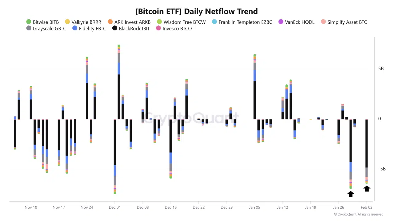 One large outflow appears in late January, followed by a second, similarly sized outflow in early February. Both stand out as among the deepest negative bars on the chart, indicating sizable reductions in ETF exposure rather than routine day-to-day variation.
Following these outflows, the price context shown alongside the timeline continues lower rather than stabilizing, suggesting that ETF selling coincided with downside pressure instead of marking exhaustion.
The clustering of these negative flows is notable. The chart does not show a meaningful recovery in netflows between the two events, pointing to sustained rather than isolated selling activity.
Exchange Inflows: Rising Supply Sent to Exchanges
The BTC UTXO Exchange Inflow SMA (7d) chart shows a clear increase in exchange inflows into early February.
The total inflow line rises toward the right side of the chart, reaching one of its highest visible levels in the observed period. The breakdown by wallet size shows that larger holder categories contribute meaningfully to this rise, rather than the increase being driven solely by smaller participants.
This expansion in exchange inflows occurs while price trends lower, a combination that historically reflects supply being prepared for sale or redistribution rather than accumulation off-exchange.
Binance Stablecoin Balances: Liquidity Leaving the Exchange
The Binance Multi-Asset Netflow Cumulative chart shows a steady decline in USDC balances beginning in mid-January and continuing into early February.
The filled USDC area contracts visibly over time, moving from higher levels earlier in the period to significantly lower levels at the right edge of the chart. There is no corresponding expansion in other assets on the chart that would suggest rotation within the exchange.
This pattern indicates that stablecoin liquidity is being withdrawn rather than held on-platform, reducing readily deployable buying power.
The BTC price line plotted alongside these flows trends downward as USDC balances decline, reinforcing the link between liquidity exit and price weakness.
Structural Read
Across all three charts, the signals are consistent:
- ETF products show repeated, outsized outflows
- Exchange inflows are increasing, including from larger holders
- Stablecoin balances on Binance are declining rather than accumulating
When these conditions appear together, the market is typically in a phase of distribution and liquidity tightening rather than quiet absorption.
Takeaway
The charts point to coordinated pressure rather than isolated noise. Capital is being pulled from ETF exposure, supply is moving onto exchanges, and stablecoin liquidity is leaving Binance.
Until these dynamics shift, either through reduced ETF outflows, falling exchange inflows, or rebuilding stablecoin balances, the market remains focused on managing downside rather than forming a durable recovery base.
The post What ETF Flows and Binance Data Indicate About Current Bitcoin Liquidity appeared first on ETHNews.
You May Also Like

Shiba Inu (SHIB) Hits 9,000% Liquidation Imbalance Right After Death Cross: Is $0 for SHIB Price Real?
Why are HYPE's major shareholders, DAT company PURR, getting more and more bullets?